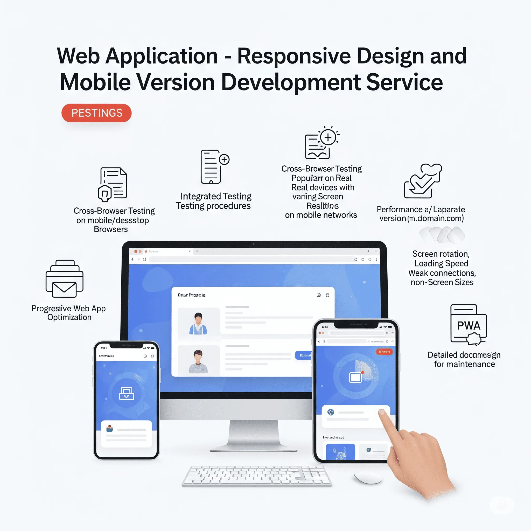
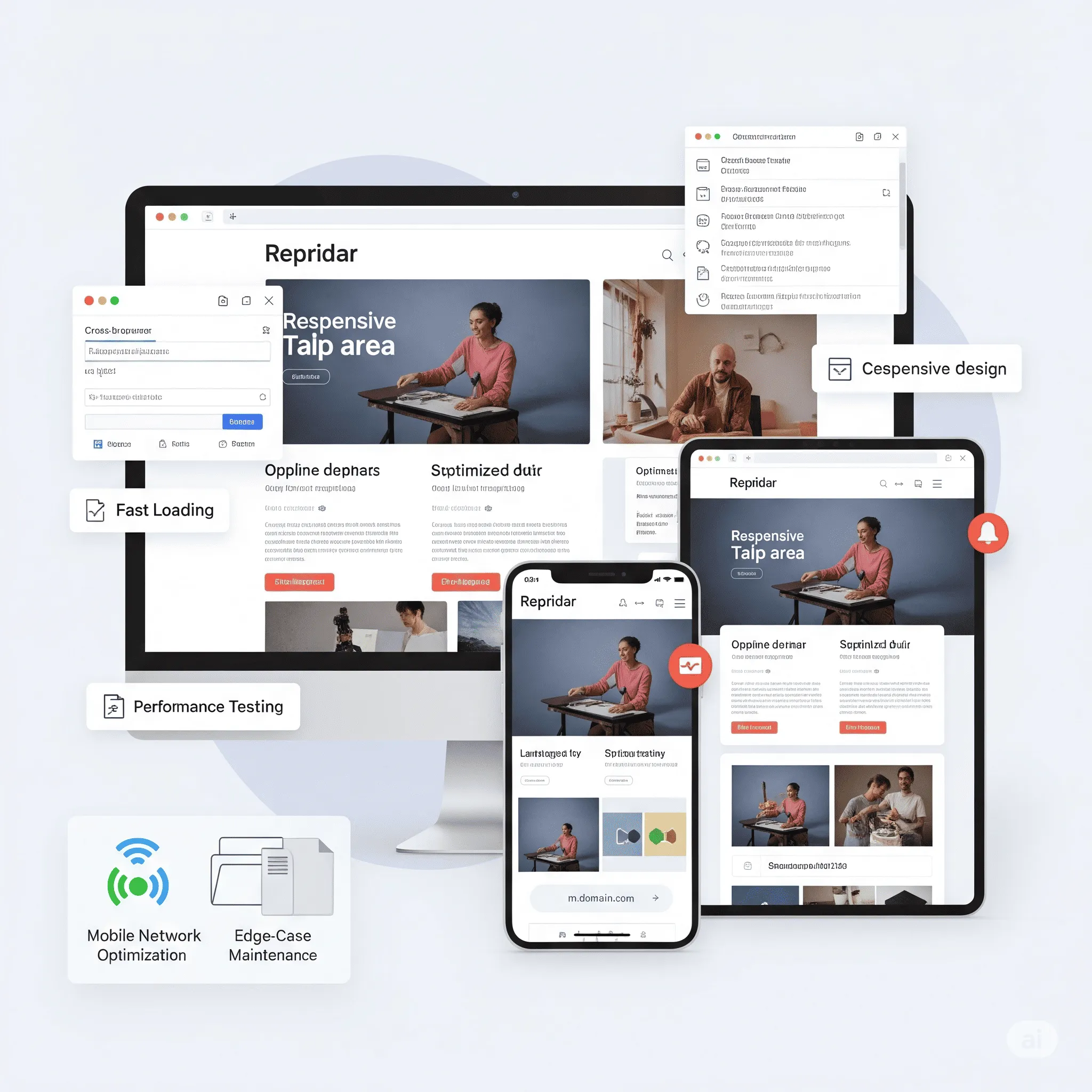
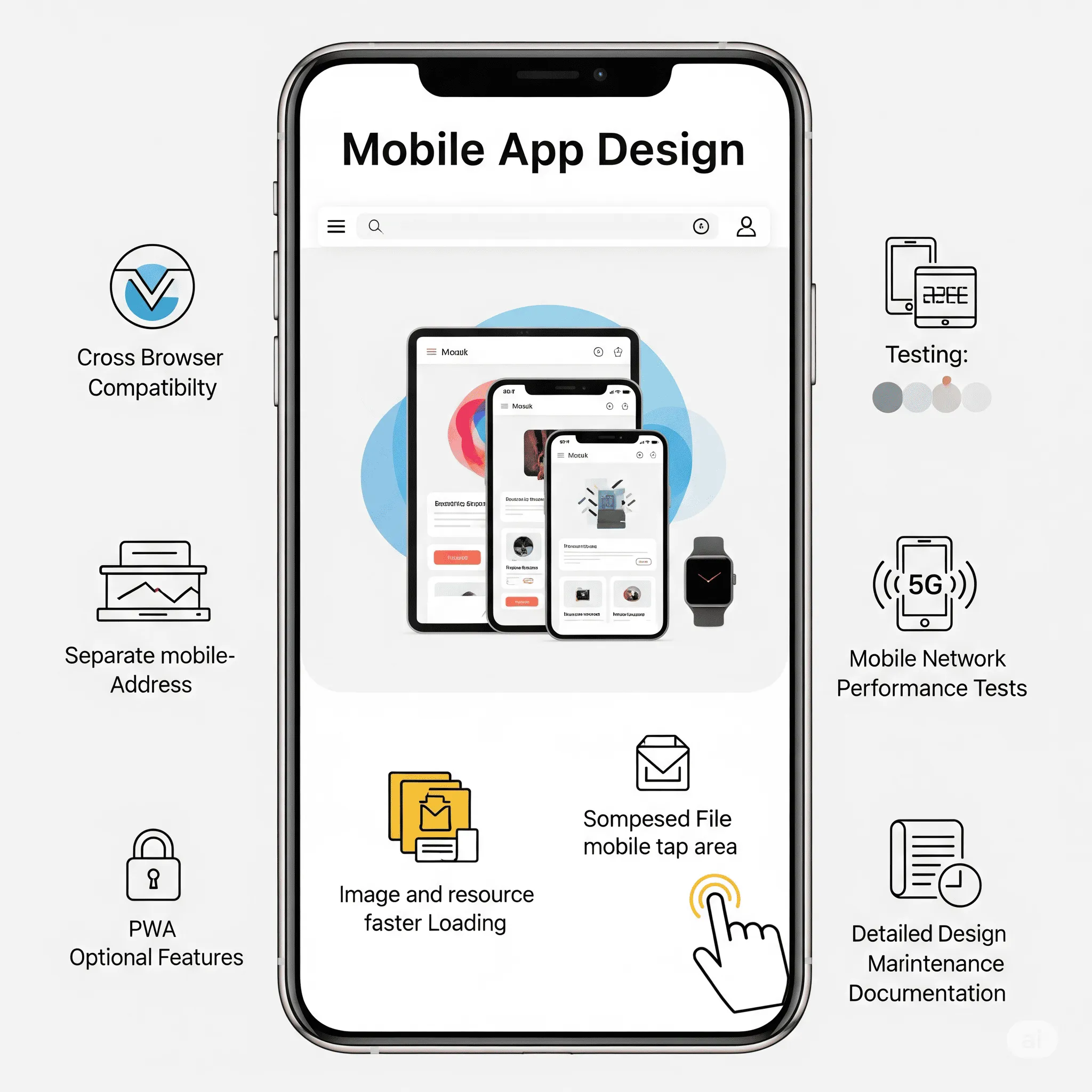
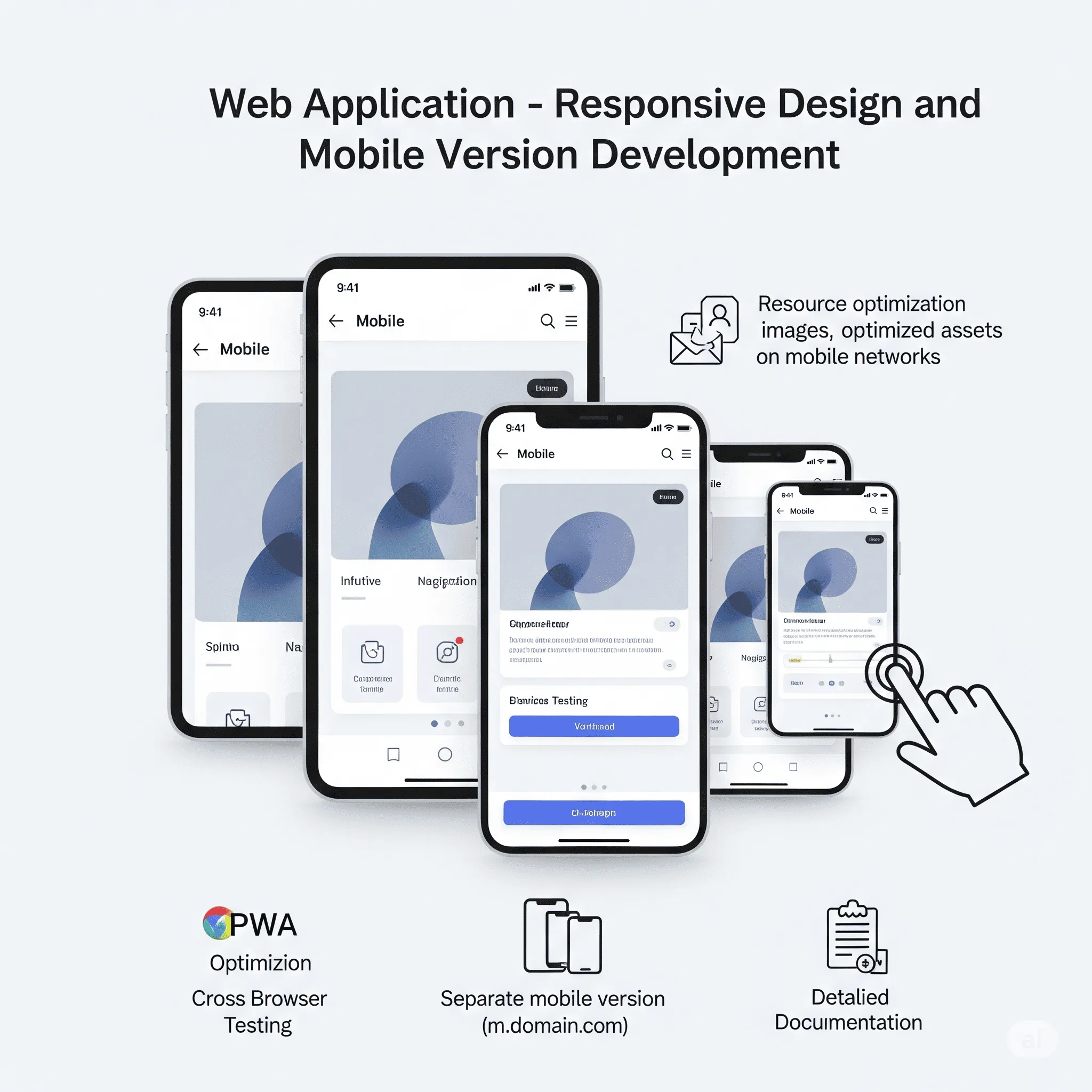
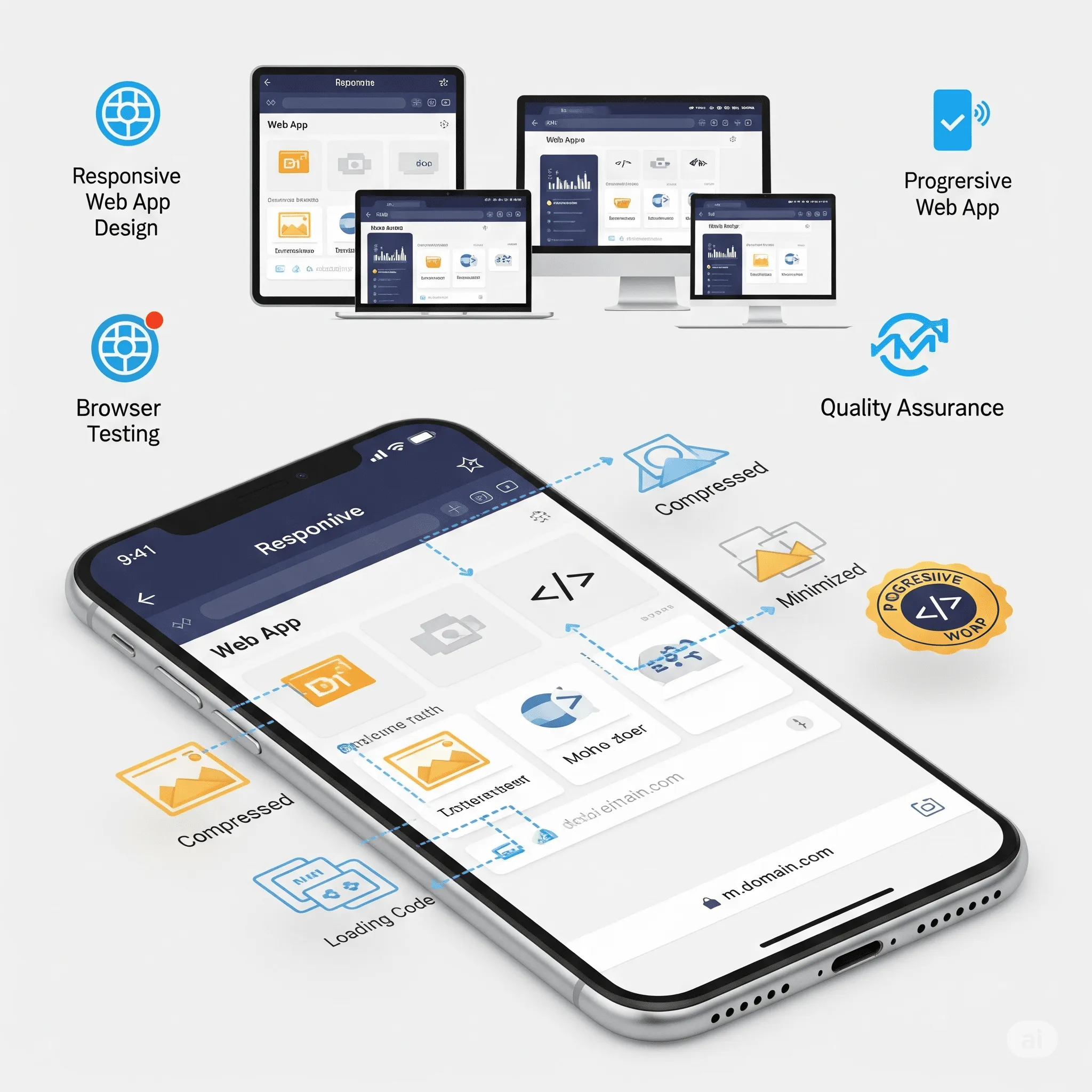
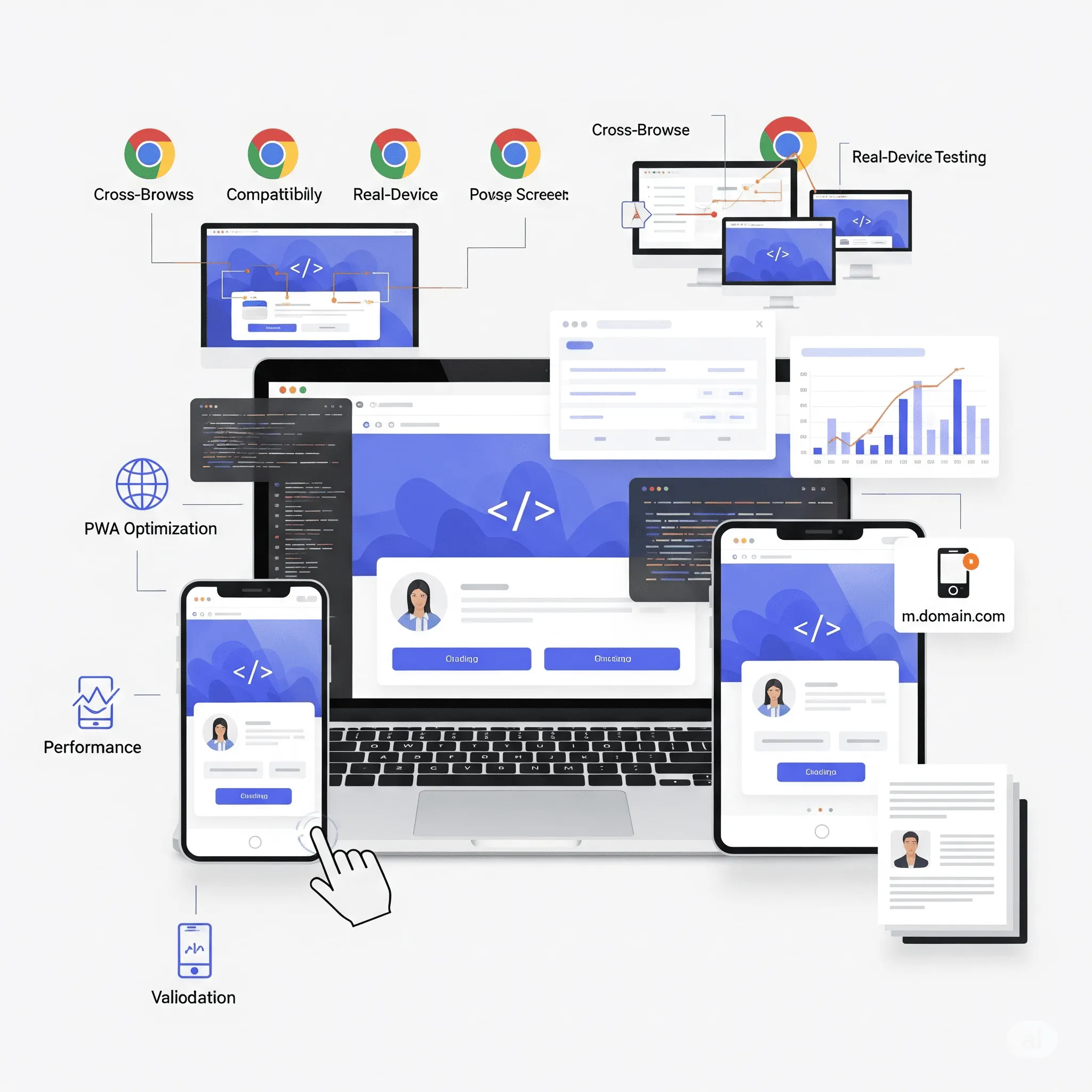
Feature goal: Ensure proper and user-friendly display of the web application on any device, including smartphones and tablets, improving accessibility and user experience.
🎉 Price from: $170 ($200)
You save: $30 (15%)
Rates: Junior $8–$12/h | Middle $20–$25/h | Senior $30–$40/h
Timeline: 2-4 days
You select the Responsive Design and Mobile Version module, register, and provide information about your current website structure. Our system matches you with a qualified developer who will adapt your site layout for different devices, ensuring smooth performance and fast load times.
Certified freelancers (Junior, Middle, or Senior levels) complete the tasks. You can choose the level of expertise that suits your timeline and budget.
A fully responsive and mobile-optimized website layout, tested across multiple screen sizes and devices, with improved loading speed, touch-friendly navigation, and SEO-friendly structure.
Yes. You can define specific mobile design requirements, such as custom navigation elements, mobile-first layouts, or unique animations. Any extra features can be discussed directly with the developer.
Don’t worry - our AI Product Manager Assistant will guide you through the best practices and help create a clear, developer-ready brief.
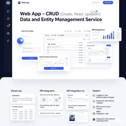
Suitable for businesses targeting mobile-first users, eCommerce platforms, online services, and startups focused on accessibility and usability. This module delivers a fully responsive interface optimized for various screen sizes, ensuring smooth navigation and fast performance on all devices. Mobile-friendly layouts and speed-optimized resources improve user experience and search engine rankings. Common clients: SaaS companies, online shops, service providers, digital agencies, and startups expanding their audience reach. PWA-ready, SEO-optimized, and designed for effortless scaling.
⚡ Limited offer — only before public launch.
Get pre-launch access to the AI Product Manager Assistant and save:
 $153
($180)
$153
($180)
 $204
($240)
$204
($240)
 $187
($220)
$187
($220)
 $136
($160)
$136
($160)
 $204
($240)
$204
($240)
Clients value this module as an essential step in delivering a seamless user experience across all devices. They highlight how the adaptive layout automatically adjusts to different screen sizes, ensuring perfect usability on desktops, tablets, and smartphones. Many appreciated the touch-friendly mobile interface, faster page load times, and optimized navigation, which led to increased customer satisfaction and reduced bounce rates. Several noted that implementing this module improved their search engine rankings and made their product or service accessible to a wider audience. They also commend its smooth integration with existing systems and its readiness for further scalability.